Overview
The Project was commissioned by the company databrand for which I worked as Art Director which opened the office in Chiasso in 2020, Switzerland. The company is involved in developing brands based on market data, all for the ecommerce market.
The project
The goal was to design a new brand that would represent the philosophy of the company, which deals with developing new emerging brands based on market demand.
Brand
Keywords

Logotype
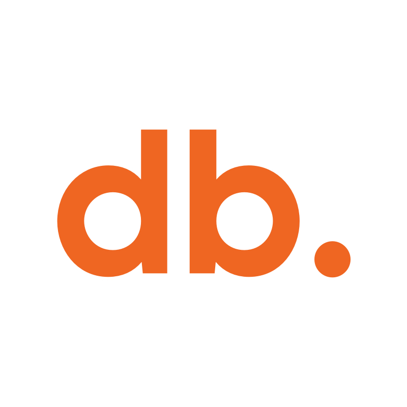
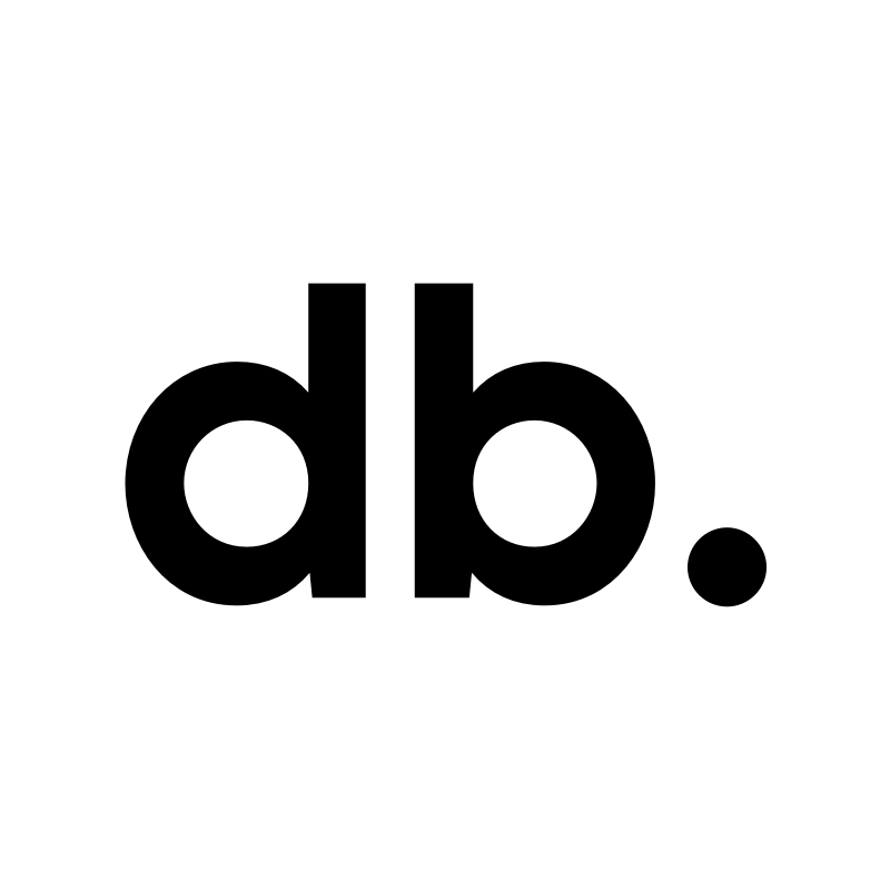
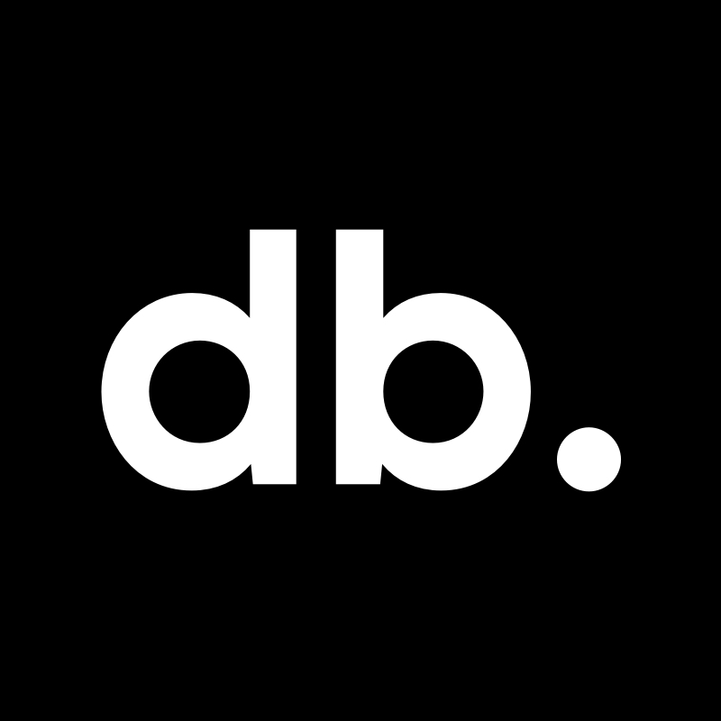
For the choice of the font, after a meticulous research, I decided that a stick character was the most correct choice, I chose a font that recalled a lot of geometric shapes, more specifically the circle, in fact the circle is as if we would represent a point, the point is the symbol to represent a unit a data, so it seemed logical to me to use a font that recalled this peculiarity, the name is written all in lowercase to better strengthen the appearance of the circle/point in the counter part of the font.
Logo color versions
One Color
Positive
Negative
Logo with patterns


Typography

Colors
For the colors of the logo I chose to use a gradient, much used in emerging startups, also expresses values of energy and brightness (sunshine), values that are very present in databrand.

Logo
The logo is an abbreviation of data brand, I thought it very interesting and particular, which gave the logo a distinctive element, in fact the d and the b are letters that can be mirrored, a very important element that in addition to giving firmness and seriousness to the logo always refers to the concept of point/data.
Website
I also designed the company’s website, for a better visualisation I recommend visiting it.


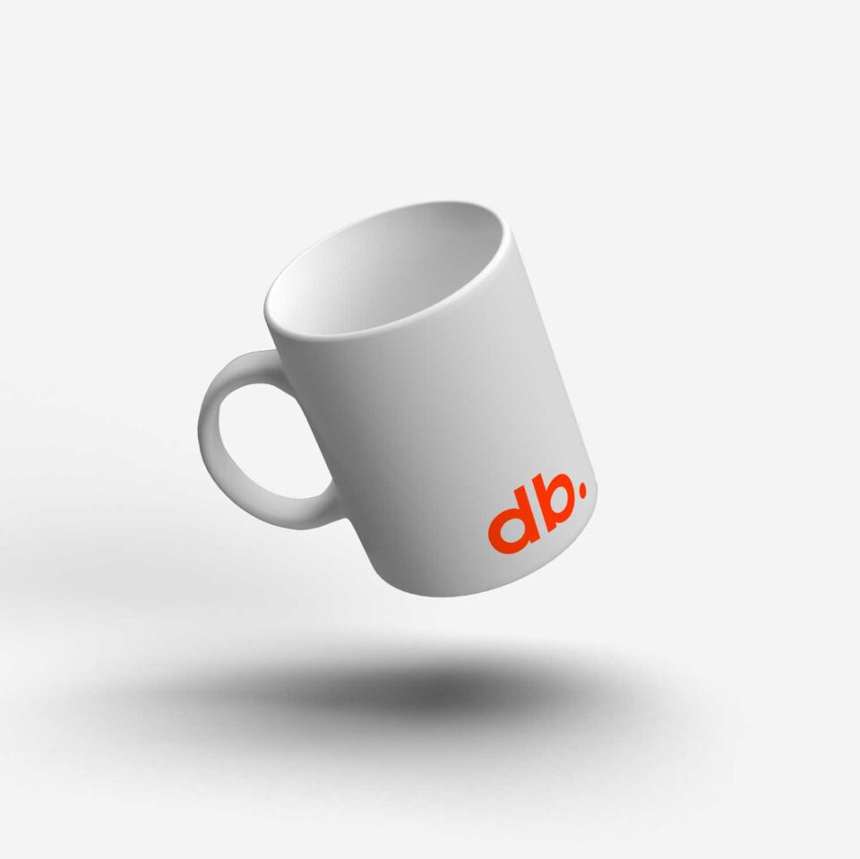
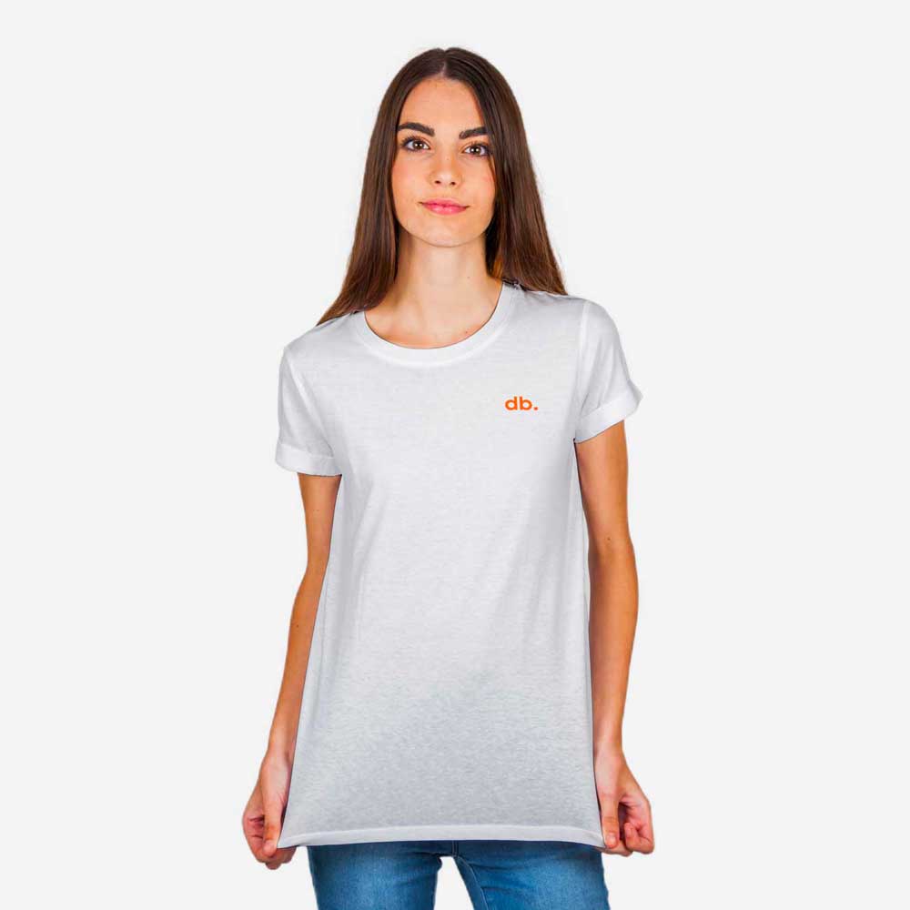
Merchandising
Company sign